

When a sale does not happen, the first instinct is to blame the number. You lower the price, and the same thing happens again. That is usually the wrong diagnosis, because most people never got close enough to the price to have an opinion about it.
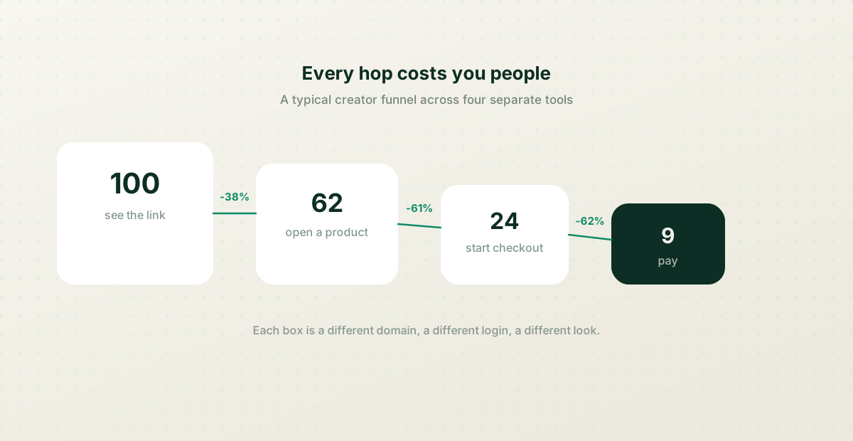
What actually happens is smaller and duller than a pricing problem. Someone taps your link, waits for a page, taps a product, waits for a different site, sees a checkout that looks nothing like the page they came from, and decides to do it later. Later does not arrive.
Count the hops, not the clicks
Every time a visitor crosses from one tool to another, a slice of them stops. Not because they changed their mind, but because a new page had to load, a new design had to be trusted, and a new decision had to be made.
A creator running the usual stack has four of these hops before any money moves. The drop at each one is rarely dramatic on its own. Together, they are the whole problem.
The three that cost the most
If you only fix a few things, fix these — they are where the biggest slices go.
- The checkout on a different domain. The buyer's brain treats an unfamiliar payment page as a risk, and hesitation at that exact moment is fatal.
- The second page load. Anything that makes someone wait after they have already shown intent is a chance for them to leave.
- The mismatch. If your link page is warm and your product page is a bare template, the second one does not feel like you, and people notice even when they cannot say why.
What one page changes
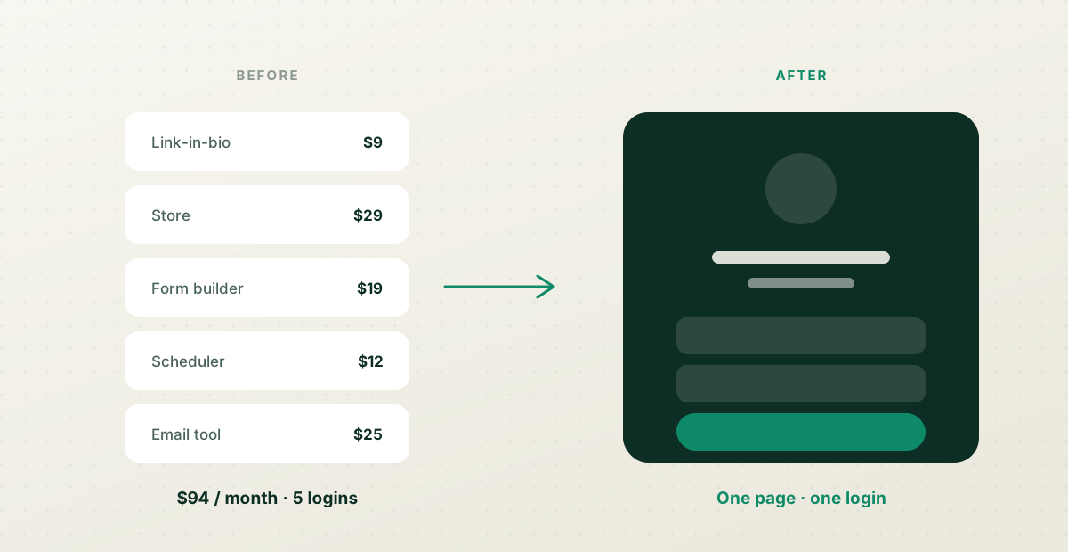
Collapsing the stack does not make your offer better. It removes the reasons people abandon an offer they already wanted.
Same brand from the first tap to the receipt. No redirect to a domain they have never seen. One place where you can actually tell which link brought the money, because it is all one system rather than four that do not speak to each other.
Where to start
Do payments first. It is the hop with the most friction and the clearest payoff, and you can move it without rebuilding anything else.
Then move the thing you send people to most — usually one product or one form. Watch what happens to the same traffic. If the number of people who finish goes up while your price stays the same, you have your answer about what the problem was.
The Leak Between the Link and the Checkout
Most lost sales aren't lost at the offer — they're lost in the handful of steps between someone deciding to buy and actually paying. Every extra click, redirect, or 'you'll be taken to another site' is a place people quietly drop off. If your bio link opens a landing page, which links to a store, which bounces to a payment provider, you've built a corridor with three doors, and each one loses a share of the people who walked in willing.
Count your own steps sometime, as a buyer. Tap your link in bio, buy the cheapest thing you sell, and note every tap and every new page that loads. If it takes more than a couple of screens to go from 'I want this' to 'paid', that's your leak. The fix is usually removing a hop — selling directly from the link rather than routing through a separate store, so checkout opens where the interest already is.
Redirects to unfamiliar domains cost trust as well as clicks. When the payment page carries your name and look rather than an unrecognised third-party checkout, people hesitate less at the exact moment they're reaching for their card. Keeping the sale on one page, under your own name, closes a gap most creators don't realise is open.
The 'DM Me to Buy' Tax
'DM me for prices' or 'comment and I'll send the link' feels personal, but it's one of the most expensive habits in creator selling. It moves the sale off the moment of interest and into a queue you have to work by hand. By the time you reply — an hour, a day later — the impulse has cooled, the buyer's moved on, and you're doing admin instead of taking payment. Every manual step between wanting and paying is a place the sale leaks out.
It also caps you at your own availability. Fifty 'how much?' messages is fifty conversations you can't have at 2am when they're actually sent, and the ones you miss simply don't buy. A visible price and a button that takes payment then and there does the same job without you present. You can still be personal in the follow-up; you just shouldn't put a human bottleneck in front of the till.
If part of your sale genuinely needs a conversation — bespoke work, high-value bookings — let the button start it, not replace it. A 'request a quote' form that captures what they want and their contact details keeps the momentum while still giving you the human step. The point isn't to remove yourself; it's to stop making people wait for you before they can commit.
Mobile Is Where the Money Actually Is
The overwhelming majority of taps on a creator's link come from a phone, often mid-scroll and one-handed. So the sale is won or lost on a small screen, and anything that assumes a desktop leaks. A checkout with fifteen fields, a coupon box demanding attention, a 'create an account first' wall — each is minor on a laptop and fatal on a phone held at a bus stop.
Test the whole path on an actual phone, on mobile data, not on your desktop over office Wi-Fi. Watch for the small cruelties: a Pay button below the fold, a keyboard that covers the field you're typing in, an image-heavy page that stalls for four seconds before anything's tappable. These are invisible from a designer's chair and obvious the moment you're the customer thumbing through it.
Support the ways people already pay on phones. Offering Apple Pay or Google Pay — a thumbprint instead of typing a sixteen-digit card number on a tiny keyboard — removes the single most tedious step in mobile checkout, and it's often the difference between a completed sale and an abandoned one. Meet people on the device they're actually on, paying the way they already pay.